Happy Tuesday everyone! Welcome to the Top Ten Tuesday now hosted by That Artsy Reader Girl. This week's topic is Cover Redesigns I Love & Hate (submitted by Rachelle @ Shell’s Stories). I love all of the books that made today's list and while I loved some of the cover redesigns some of them just didn't work for me at all. Below I'll include the original (or early edition) and the redesign in question. Here we go, in alphabetical order by category:
Love:
Across the Universe (Across the Universe #1) by Beth Revis - There have been a few redesigns to this. There's nothing wrong with the original (besides the fact that it took me forever to figure out what I was supposed to be looking at in the stars), but this redesign is my favorite cover of any in the series.
Christine by Stephen King - I own a copy with that original cover, but I'm going to be honest and say that redesign is my favorite of all of the covers this has had.
City of Bones (The Mortal Instruments #1) by Cassandra Clare - I love this whole series and while the original cover is alright, I definitely prefer the 2015 redesigned editions.
Throne of Glass (Throne of Glass #1) by Sarah J. Maas - I'm downright thankful that we have the redesigned cover.
The Monstrumologist (The Monstrumologist #1) by Rick Yancey - I'm so glad they went with the style of the redesign for the rest of the series. By the way, if you haven't read this series what are you waiting for?
Hate:
The Diviners (The Diviners #1) by Libba Bray - This whole series has gotten the short end of the stick when it comes to redesigns. I wonder what they're going to do with the upcoming fourth book?
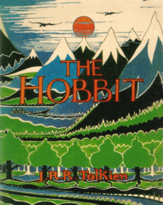
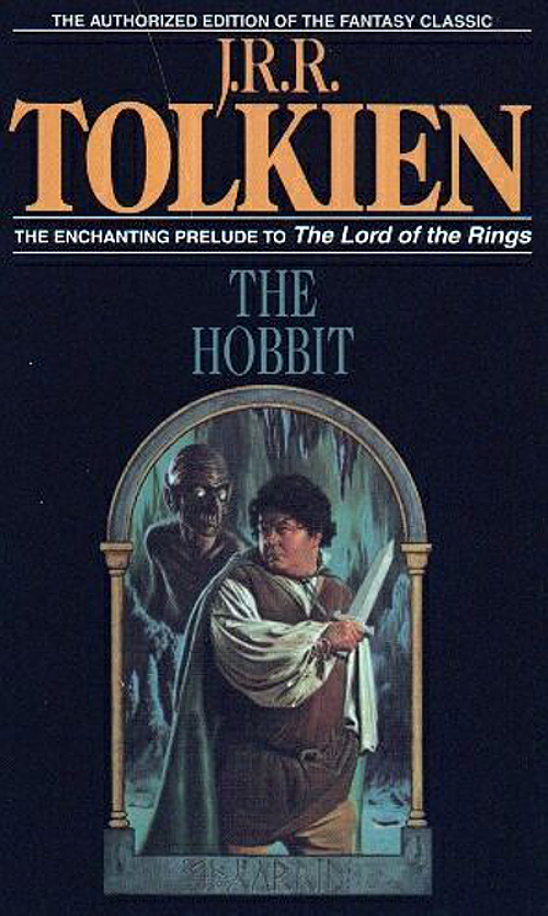
The Hobbit by J.R.R. Tolkien - This has had a few great covers through the ages, even the original. This particular redesign is the edition that I read in my middle school library and it is terrifying.
Scary Stories to Tell in the Dark (Scary Stories #1) by Alvin Schwartz - I love Brett Helqust's style in A Series of Unfortunate Events, but his edition is nowhere near as terrifying as the original.
Snow Crash by Neal Stephenson - Okay, there are so many different editions and redesigns of this, but I still love the 1993 paperback while the 2000 paperback edition looks so borrowing. You can see one of my other favorite covers for this book here.
White Cat (The Curse Workers #1) by Holly Black - I'm still upset about the redesign for this series. They decided to redesign the first two covers just in time for the final book to be released, so we never got to see how cool the cover for Black Heart would have been in the original style. I'm not usually a fan of covers with faces (obscured or not), but the original totally fit the tone of the story.
What are some of your favorite and least favorite book cover redesigns? Have you read any of these books? As always, thanks for visiting my blog and perhaps commenting down below!


The original Scary Stories cover is amazing and perfect and they shouldn't have messed with it. I'm not a fan of The Diviners, but I'm surprised that such a popular series hasn't gotten a really great cover redesign. Great picks!
ReplyDeleteYes! Thanks for coming over, Alicia. :)
DeleteOoh Across the Universe- I did that one too (and I agree)! I really like that second cover. I like the Monstrumologist redesign too- that second cover is nice!
ReplyDeleteThere have been good Hobbit covers over the years,
Woot! Thanks for coming over, Greg.
DeleteNever read the TOG series even though I did intend too. But from all accounts, these redesigns are so much better! Sometimes the new concept works, and sometimes it doesn't, but I think of late, more often than not, it works so much better.
ReplyDeleteIt's definitely worth it. I'm so glad they did too!
DeleteGreat list! I love that redesign of Christine - I love a really simple cover - and the redesigns of The Diviners make me so sad. That original cover is so pretty!
ReplyDeleteThanks! Christine really works. :)
DeleteUGHHHH The Diviners series is on my last nerve. Each redesign is worst that the last. They should just give up and put them out blank.
ReplyDeleteAt least it isn't just me there!
DeleteThe Diviners series made my list as well. I love the ToG redesign.
ReplyDeleteMy TTT https://thereadingrebel.wordpress.com/2019/08/06/top-ten-tuesday-book-cover-redesigns-you-loved-or-hated/
I don't blame you there!
DeleteThanks for sharing!
Yeah, that redesign of Christine was really well done.
ReplyDeleteMy TTT.
For sure. Thanks for sharing.
DeleteOh nooo, that redesign for The Hobbit is just... Terrifying!? Why would they do that? Lol 🙈I've seen The Diviners a few times on peoples' list for today's TTT and I agree the original is heaps better. I loved the redesign for ToG though--it fit's Celaena's character so much better than the original!
ReplyDeleteMy TTT post
I'd love to know who made that decision,
DeleteThat IS a truly awful redesign of the cover for The Hobbit! So scary and weird!
ReplyDeleteI love the story, but that cover practically gave me nightmares. :D
Deletegreat post and i definitely agreed with the loves, the hates? have to think harder on those
ReplyDeletesherry @ fundinmental
It was a hard cool. Thanks for sharing!
DeleteI'm not a Tolkien fan, but that redesign is the worst I've seen!
ReplyDeleteLisa @ https://hopewellslibraryoflife.wordpress.com/
You said it there!
DeleteI'm so glad for the Throne of Glass redesign, also! The Monstrumologist cover is also so lovely, though the first one does still intrigue me, haha, and it's the copy I own. I'm so bitter about the redesigns for The Diviners, haha. And that original for Snow Crash is so much better!
ReplyDeleteThe Snow Crash cover totally suits it. :)
DeleteI have seen ToG around a bunch today, and I agree, the new cover is so much better.
ReplyDeleteI've seen it all over the place - good choice. :)
DeleteI ran out of time to work on my list, but I definitely had ToG on there!
ReplyDeleteThis one took quite a bit of time together didn't it. :)
Delete